

B2B Website Redesign: What to Fix Before You Change How It Looks

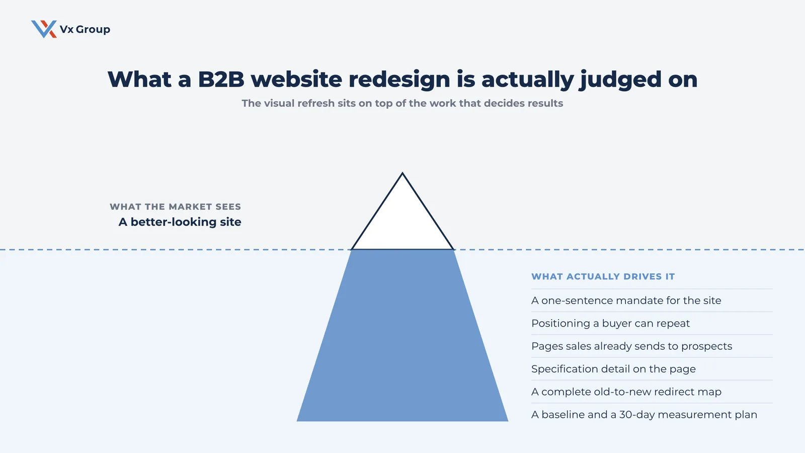
A B2B website redesign should fix what the site says and how buyers find it before anyone discusses visual direction. Decide what the site has to accomplish, audit which pages already earn traffic and sales attention, correct the positioning, then plan the URL migration. Design comes last, and it converts better when those four decisions are already made.
TL;DR
- Two things sink most B2B redesigns: the positioning stays as vague as it was before, and nobody plans the URL migration.
- Write a one-sentence mandate for the site before you look at a single design comp.
- Audit which pages earn organic traffic and which pages your sales team actually sends to prospects. Those two lists rarely overlap, and both belong in the new site.
- The redirect map is the highest-risk deliverable in the project. One row per old URL, no exceptions.
- Design for three readers on the buying committee: the technical evaluator, the owner, and the person who has to justify the spend internally.
- Watch five numbers for 30 days after launch and fix what the first two weeks tell you.
A typical B2B website redesign starts with a design brief. Someone circulates competitor screenshots, leadership agrees the current site looks dated, and an agency gets hired to make it modern. Four months later a better-looking site launches carrying the same unclear positioning it had before, and organic traffic falls by a third in week one because nobody built a redirect map.
That project cost real money and moved nothing. The site looks current. The phone rings at the same rate. Sales still explains what the company does on every first call, because the homepage never did it for them.
Sequence is what separates that outcome from a good one. A redesign is a revenue project with an SEO risk bolted onto it. Run it as a design project and you inherit the risk while skipping the revenue.
Defined Term: Website redesign.
A rebuild of a site’s structure, content, and visual design, usually on a new template or platform. Because URLs, page titles, and internal links change during the rebuild, a redesign always carries search-visibility risk that a visual refresh does not.
Do you actually need a website redesign, or do you need a clearer message?
Three different problems get called “a redesign,” and only one of them requires rebuilding the site. Naming which one you have saves companies six figures every year.
The first problem is a message problem. Visitors land, cannot tell in eight seconds what you make or who you serve, and leave. The second is a structure problem. The content exists somewhere but buyers cannot navigate to it, and neither can Google. The third is a platform problem. The site is slow, the forms break on mobile, nobody on staff can edit a page without calling a developer.
A message problem gets solved by rewriting pages on the site you already have. A structure problem gets solved by reorganizing navigation and URLs. A platform problem is the only one that requires a rebuild. Most companies have all three, which is a legitimate reason to redesign. Plenty of companies have only the first, and they spend redesign money to publish the same confusing sentences in a nicer font.
Run the three-question test before you approve a budget
Answer these in writing, with your sales team in the room:
- Can a stranger tell what we do, who we do it for, and why we are worth a call, from the homepage alone, in under 10 seconds? Test it on someone outside the industry. Watch them read it.
- When a prospect asks a specific question during a sales call, is there a page we can send them? If sales answers the same six questions by hand every week, the site has a content gap that a redesign will not automatically fill.
- What does the site cost us today? Pull the last 12 months of form fills, the bounce rate on your top five pages, and mobile page load times. A redesign needs a baseline to beat.
If the answers point to message and content gaps only, fix those first. You will spend a fraction of the budget and learn what the new site actually needs to say.
Separate the "must fix" list from the "would be nice" list
Write two columns before the project starts and get leadership to sign off on both. The must-fix column holds things costing you deals right now: unclear positioning, missing product detail, forms that fail on a phone, load times over four seconds, no proof anywhere on the site. The nice-to-have column holds the animation, the custom illustration set, the video header. Scope creep in a redesign almost always comes from the second column eating the budget committed to the first.
Step 1: What should a B2B website redesign accomplish, and for whom?
Write one sentence that names the primary job of the site, then hold every later decision against it. Companies that skip this step argue about button colors in month three because there is no standard to settle the argument.
Write the one-sentence site mandate
The format that works: “This site exists to help [specific buyer] understand [specific capability] well enough to [specific next step].”
A real example from a mid-market industrial manufacturer: “This site exists to help plant engineers at food and beverage producers understand our custom conveyor capability well enough to send us a drawing.” That sentence resolves dozens of downstream decisions. It says the drawing upload matters more than the newsletter signup. It says the engineering detail pages matter more than the culture page. It says the language should sound like a plant engineer talks.
Write yours, get four people to agree to it, and put it at the top of the project brief.
Name the three readers who have to get what they came for
Long-cycle B2B purchases get decided by a group. Name the actual people, using the titles at your real accounts:
- The technical evaluator who has to believe you can do the work. Wants specifications, tolerances, materials, capacity, integration detail, and examples close to their own application.
- The owner or executive sponsor who has to believe you are a company worth depending on for a decade. Wants evidence of stability, named customers, tenure, and a sense that you are the size you claim.
- The person who has to justify the spend internally. Wants pricing structure, terms, lead times, and something they can forward without adding a paragraph of explanation.
Every important page should serve at least one of the three deliberately. Pages that serve nobody in particular are the pages that get cut in Step 2.
Set the two numbers you will judge the project by
Pick two, write them down, and record today’s value. Useful pairs: qualified form fills per month and organic sessions to product pages. Or sales-cycle length and the percentage of first calls where sales has to explain the basics. Vague goals like “modernize the brand” cannot be reviewed at the 90-day mark, so the project never gets honestly evaluated and the same mistakes repeat at the next rebuild.
Step 2: How do you audit what is already working before you rebuild?
Pull the data on your current site before anyone touches a wireframe, because a redesign that discards pages already earning traffic and trust is how companies lose a third of their pipeline in a quarter. This audit produces one artifact: a page-by-page inventory with a keep, rewrite, merge, or retire decision on every row.
Pull the pages that earn organic traffic and links
From Google Search Console, export the last 12 months of pages by clicks and impressions. From your analytics, export landing pages by sessions and conversions. Flag anything in the top 50 by clicks. Those pages have earned rankings you are about to put at risk, and they need a deliberate decision, a preserved URL, or a mapped redirect.
Also flag any page with inbound links from other sites. Those links are the reason you rank at all, and they point at a specific URL. Retire that URL without a redirect and the link value evaporates.
Ask sales which pages they actually send to prospects
This list comes from people. Analytics will not surface it. Ask each salesperson for the five URLs they paste into emails most often. You will usually get a spec sheet PDF, one or two application pages, a capabilities page nobody in marketing considers important, and something buried three clicks deep. These pages carry commercial weight that traffic numbers understate, because they show up late in a deal when someone is deciding.
Ask the same people which page they wish existed. That answer is the content plan for the new site.
Build the keep, rewrite, merge, retire inventory
Put every URL on the site into one table. For a 60-page site this takes an afternoon and prevents the most expensive mistake in the project.
| Current URL | Monthly organic clicks | Inbound links | Sales sends it | Decision |
|---|---|---|---|---|
| /products/valve-actuators | 210 | 6 | Yes | Keep URL, rewrite copy |
| /capabilities/machining | 95 | 2 | Yes | Keep URL, expand detail |
| /about-us/our-history | 4 | 0 | No | Merge into company page |
| /blog/2019-show-recap | 0 | 0 | No | Retire, redirect to insights index |
| /services.html | 60 | 1 | Sometimes | Migrate to /solutions/, redirect |
The decision column is the part that matters. Every retired row becomes a line in the redirect map in Step 4.
Step 3: Why does the message have to be fixed before the layout?
Layout is a container for words, and a designer cannot build the right container for words that do not exist yet. Companies that design first end up writing copy to fill boxes, which is how a site ends up with a headline that had to be six words long and therefore says nothing.
Write the positioning paragraph first
Before any page copy, write one paragraph covering four things: what you make or do, who it is for, what makes you a better choice for that buyer than the two competitors they are also calling, and the proof. If the third part is hard to write, you have found the real project. That difficulty is the reason the last redesign did not work.
Most B2B sites describe the company from the inside out, using internal language and listing everything the company offers. Buyers arrive with a problem and scan for evidence you have solved it before. Write toward that.
Rewrite the homepage hero in plain language
The top of the homepage needs to answer three questions in a single glance: what this is, who it serves, and what to do next. Write it the way you would say it to someone at a trade show booth. If the sentence contains “solutions,” “innovative,” or “world-class,” you have written a placeholder. Replace it with the specific thing you make and the specific industry you make it for.
Give every page one job and one next step
Go through the sitemap and write, next to each page, the single action you want a reader to take when they finish it. Pages with three competing calls to action convert worse than pages with one. A product page should make it easy to request a quote or send a drawing. An article should offer the related capability page or a subscription. A capabilities page should lead to a conversation.
Pages where you cannot name the next step are pages that should not survive the rebuild.
Ready to grow?
Get a plain read on whether your site needs a rebuild or a rewrite before you commit the budget.
Step 4: How do you plan a URL migration without losing organic traffic?
The redirect map is the deliverable that determines whether traffic survives launch, so build it as a real document with one row per old URL and have two people check it. A missing redirect turns a ranking page into a 404, and Google removes the page from results within a few weeks. This is the single most common cause of the post-launch traffic collapse that makes leadership regret the whole project.
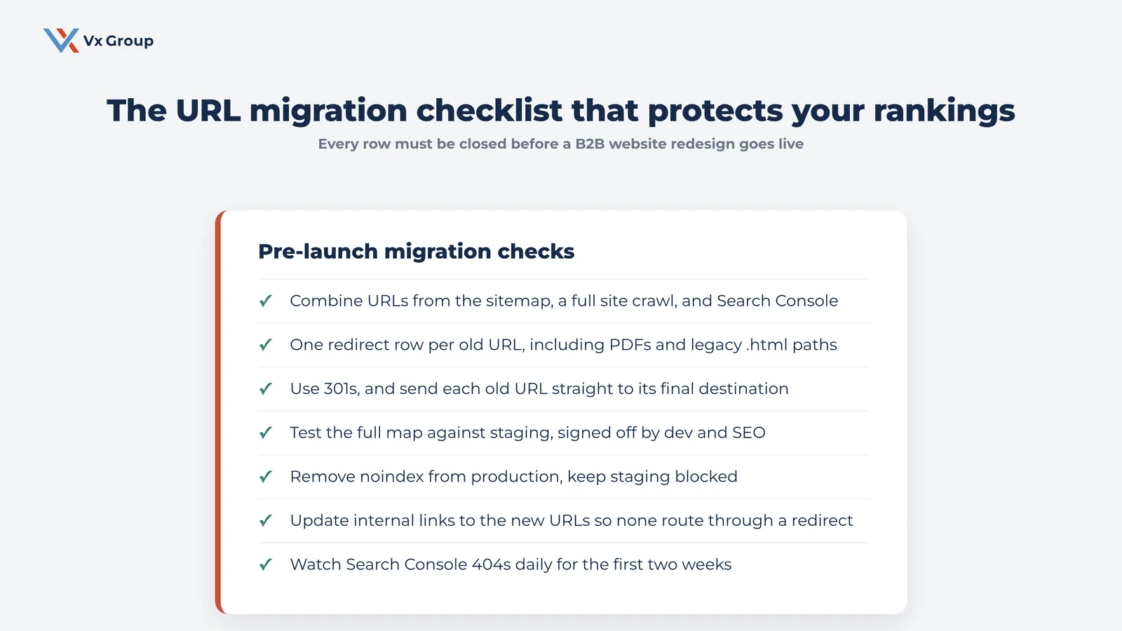
Export every URL from all three sources
One export is never complete. Pull all three and combine them:
- Your XML sitemap, which gives you what the CMS knows about.
- A full crawl of the live site with a crawler like Screaming Frog, which finds orphan pages the sitemap omits.
- Google Search Console, which reports URLs that earn impressions, including old ones the CMS forgot and pages you did not know existed.
Deduplicate the combined list. Add every PDF, every image that earns search traffic, and every legacy URL pattern such as `.html` endings or old `?page_id=` query strings.
Map old to new, one row at a time
Every old URL gets a destination. Where a direct equivalent exists, point to it. Where content merged, point to the merged page. Where content is genuinely gone, point to the closest relevant section page.
Example redirect map (illustrative structure, use your own URLs):
| Old URL | New URL | Type | Reasoning |
|---|---|---|---|
| /products/valve-actuators | /products/valve-actuation/ | 301 | Content preserved and expanded. Ranks for three commercial terms. |
| /about-us/our-team | /company/leadership/ | 301 | Direct equivalent on new structure. |
| /services.html | /solutions/ | 301 | Legacy file extension retired. |
| /blog/2019-show-recap | /insights/ | 301 | No equivalent page. Send to section index. |
| /wp-content/uploads/spec-sheet.pdf | Leave in place | None | PDFs earn inbound links. Keep the URL live. |
Avoid the shortcut of redirecting everything to the homepage. Google treats a bulk redirect to the homepage as a soft 404 and drops the rankings anyway, and a buyer looking for actuator specs who lands on your homepage leaves.
Use permanent redirects and test them on staging
Every mapped redirect should be a 301, which passes ranking signals to the destination. A 302 tells search engines the move is temporary and the signals stay with the old URL. Test the full map against the staging site while you can still fix it, which means before launch. Have both the developer and whoever owns SEO sign off on the results. Chains matter too. An old URL that redirects to a second URL, which then redirects to a third, loses value and slows the page down. Send each old URL straight to its final destination.
Keep the old sitemap available for one crawl cycle
Submit the new sitemap at launch and leave the old URL list discoverable for a few weeks so crawlers find the redirects quickly. Then watch Search Console’s coverage report daily for the first two weeks. Spikes in 404s tell you exactly which rows the map missed, and fixing them inside a week usually recovers the rankings.
Step 5: How do you design a site for a B2B buying committee?
Design for the three readers you named in Step 1, and accept that they want different things from the same page. The technical evaluator, the owner, and the internal justifier arrive at different moments with different questions, so the page has to layer information so each of them can find their part without scrolling past the others’ part.
Give the technical evaluator specifics on the page
Put real detail in the HTML itself, where a crawler and a first-time visitor can both read it. Gate a PDF version if you want the contact information, and publish the substance on the page either way. Capacity ranges, materials, tolerances, certifications, standards you build to, integration requirements, typical lead times. Detail on the page earns rankings for the specific terms engineers search, and it answers the question that decides whether you make the shortlist. A page that says “precision components for demanding applications” tells an evaluator nothing and ranks for nothing.
Give the owner evidence you are a company worth depending on
Named customers where you have permission. Years in operation. Plant square footage, equipment lists, headcount. Photographs of the actual facility and the actual people. Certifications with dates. This reader is deciding whether you will still be here in eight years, and generic stock photography of a boardroom actively works against you.
Give the internal justifier something forwardable
One page that lays out how you price, how you scope, what the process looks like, and what happens in the first 30 days of working together. Long-cycle buyers have to sell you internally, and they do it by forwarding a link. Make that link easy to find and easy to read on a phone.
Design mobile first for the moments that matter
A plant engineer opens your site from the floor. A buyer reads your capabilities page in an airport. Mobile is where forms break, tables overflow, and PDFs become unreadable. Test every form, every table, and every spec download on a real phone before launch.
Step 6: What belongs on the pre-launch checklist and the 30-day measurement plan?
Work a written pre-launch checklist in one sitting with the whole team present, because the failures that hurt most are boring ones: a form that posts nowhere, analytics that never got installed, a staging site left open to indexing. Assign every line an owner and do not launch with open rows.
| Check | Owner | Why it matters |
|---|---|---|
| Full redirect map tested against staging, zero unmapped URLs | Dev + SEO | Prevents the post-launch traffic drop |
| Every form submits and the notification email arrives | Marketing | A silent form loses every lead it collects |
| Analytics and Search Console installed and verified on the new site | Marketing | Without a baseline you cannot evaluate the launch |
| `noindex` removed from production, staging still blocked | Dev | Sites launch invisible more often than anyone admits |
| Titles and meta descriptions written for every indexed page | SEO | Carried-over defaults produce duplicates across the site |
| Images compressed and served as WebP, load under three seconds on mobile | Dev | Speed affects both rankings and form completion |
| Tested on Chrome, Safari, Edge, iOS, Android | QA | Layout breaks are browser-specific |
| Full backup and database export taken immediately before launch | Dev | The escape hatch if something goes wrong |
| Every internal link points at a new URL, no links through redirects | Dev | Redirect chains slow pages and dilute signals |
| Sitemap submitted, robots.txt reviewed | SEO | Speeds up recrawling of the new structure |
Watch these five numbers for 30 days
Check them weekly and compare against the baseline you recorded in Step 1:
- 404 errors in Search Console. Should be near zero. Any spike is a missing redirect row.
- Organic clicks to your top 20 pages. Expect a dip of roughly 10 to 20 percent in the first two weeks as Google recrawls, then recovery. A drop that keeps going means the migration has a real problem.
- Qualified form fills. The number that pays for the project.
- Mobile load time on your five most-visited pages. Regressions creep in as content gets added.
- Pages sales actually sends. Ask again at day 30. If they are still sending old links, the new structure did not solve the problem they had.
Fix what the first two weeks tell you
A launch is the start of the work. Budget two weeks of developer and writer time after go-live specifically for fixes, and hold it. Teams that treat launch day as the finish line leave broken forms and missing redirects in place for months because the project is officially closed and nobody owns it.
Where B2B website redesigns go wrong
The failure patterns repeat across industries:
- Design leads and copy follows. Words get written to fill boxes, so the site says less than the old one did.
- No redirect map, or a map built the week of launch. The most expensive mistake available, and the most preventable.
- The site talks about the company and never names the buyer’s problem. Internal language survives the rebuild untouched.
- Detail gets locked behind forms. Gating every specification keeps you out of the searches engineers actually run.
- Nobody asked sales anything. The pages that close deals get retired because they had low traffic.
- Success stays undefined. With no baseline and no target, the project cannot be evaluated, so the same mistakes carry into the next rebuild.
- The scope grows sideways. Animation and illustration consume the budget set aside for content that answers buyer questions.
Field Notes:
A regional equipment manufacturer came to us three months after a $90,000 redesign, asking why leads had dropped. The site looked far better than the old one. The problem was in the details: 340 old URLs had gone to a single homepage redirect, the product pages had lost most of their specification tables in the rewrite, and the two capability pages sales relied on had been merged into one thin page. Rebuilding the redirect map row by row and restoring the specification detail brought organic traffic back over about four months. None of that work required a new design. It required the work that should have happened before the design started.
Where to start this week
Do the audit before you talk to an agency. Export your top 50 pages by organic clicks, ask every salesperson for the five links they send most, and write the one-sentence mandate for the site. Those three artifacts take a week to produce and they change every conversation that follows, including the price.
Then write the positioning paragraph. If you cannot articulate why a buyer should choose you over the two competitors they are also calling, no amount of design will do it for you, and finding that out before you spend the money is worth the week it takes.
Ready to grow?
We will look at your current site, your search data, and your sales team’s answers, then tell you whether you need a rebuild or a rewrite.
Related reading
- Brand Modernization for B2B Companies
- B2B SEO Strategy: How to Rank for the Terms That Actually Convert
- B2B Brand Strategy
- B2B Brand Authority
- Industrial B2B Marketing
FAQs
About the Author: Jacob Camhi
